If your memory goes as far back as your high school history classes, you may remember a guy named Theseus. He did a whole bunch of stuff in Greek mythology and frankly, he shouldn’t be proud about half of it (but that’s just my opinion). In any case, one of his better-known shenanigans includes killing the Minotaur who was living inside Daedalus’ Labyrinth.
Lucky Theseus got help from Ariadne who had fallen in love with him. It turns out she was pretty crafty, and on Daedalus’ advice, she gave Theseus a ball of thread so he could find his way back out of the Labyrinth. Theseus got inside, killed the Minotaur, found his way out, fled with Ariadne and later abandoned her on a random island. But that’s beside the point.
The point is that Ariadne gave Theseus exactly what he needed to accomplish what he came to do. His experience was smooth and easy.
Guidelines: easy, simple and smooth
Likewise, in the world of websites, it will pay to make sure that your users’ experience is easy, simple, and smooth. Indeed, the feeling of ease is what your visitors will remember about you, your website, and your brand.
In this article, I’m going to break down some of the heavier components you can improve to make it happen. Focusing on improving these simple things will likely help increase your conversion rate. On top of creating a positive feeling, it will make you look more professional, trustworthy, and improve your credibility.
Navigation
Let’s start with your navigation. It’s the roadmap to your whole website, which is why you need to make it extra clear and keep it simple. But fear not, even if you have a website with a ton of pages, it can be done.
Keep it to a minimum
The first thing to do is to limit the number of items you have in your navigation. Try to aim for five to six items at most in your main menu. It will reduce choice paralysis for your user. Say you had twelve items: where should she start? Will she have to read it all before she finds what she needs? With a concise navigation, your user will see at a glance each option and make a quick decision to click on an item.

If you’re looking at your site and see too many pages but you don’t know how to bring their number down: try to think about combining different pages. Let’s say you have three about pages in a drop-down. One for yourself, one for your team, and one for your company. Your users won’t take the time to click and read through each of them (you don’t have to take my word for it, you can check it for yourself with your analytics). So one thing you could do is combine these three pages into one page with three sections. That’s your best option.
But sometimes that’s not possible. For example, I wouldn’t combine different services (and in certain cases, products) on one single page. What you can do instead is use a master page with all your services/products and link to each of them. This is the only instance where I’d use a drop-down, with the master page as the main item and the secondary pages in the drop-down.
Forget drop-downs…
Except for the case mentioned above, I avoid drop-downs like cats avoid water. Indeed all the items in this type of menu are hidden from view. You can’t see everything at a glance. And in a lot of cases, a user might completely miss everything under a drop-down, say if they don’t hover over it.
In case you can’t do without your drop-downs, make sure to put an arrow or a plus sign next to the main items. It’s a way to let your user know that something’s under there. But remember that this won’t guarantee your user sees it or even understands what it means.

…and hamburgers
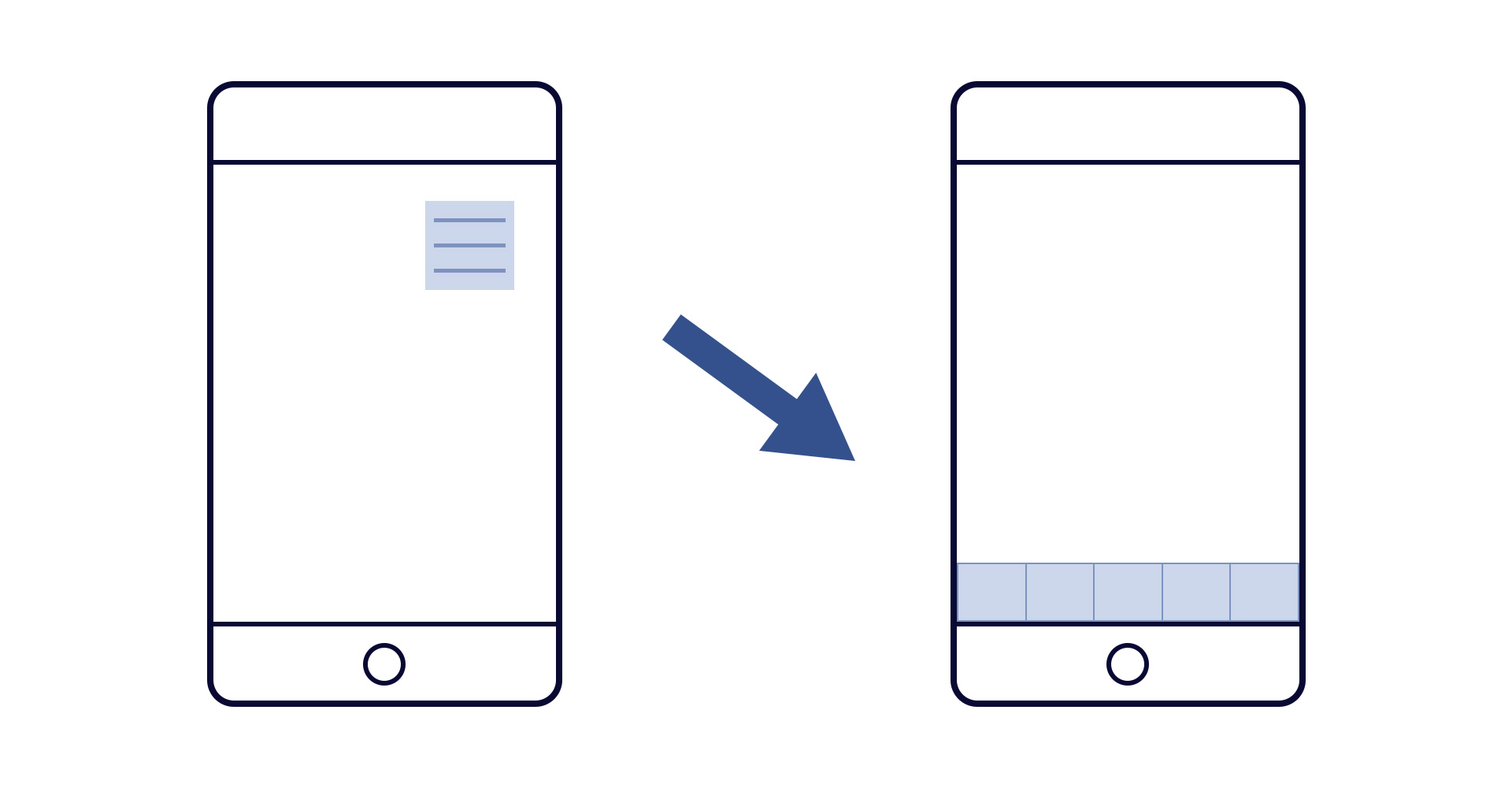
Countless tests have also shown that hamburger menus are not a great pattern. In fact, users often miss a navigation hidden behind it. So you might want to rethink how your navigation displays on smaller screens, especially if you want to make sure your users don’t miss anything.
A better alternative to the hamburger is an icon bar either at the top or bottom of the screen. Think of the Facebook app menu. And if you’ve limited yourself to five or six items, this is a viable option and much more user-friendly.
Include your full navigation in your footer
In case you have a large website that needs an intricate navigation (and even if you don’t), you could always have your full menu in the footer. In fact, it will serve as a sitemap displayed on every page of your website.
Be mobile ready
Your site needs to adapt to any screen size

I probably don’t need to stress how important mobile optimization is. As a matter of fact, I think today we’re already way beyond this point. Mobile is the crucial part of the game and bigger screens have now taken the runner-up position. But to be future proof, your website needs to be optimized for any screen size (think of watches, bendable phones or tablets, etc.) When designing, I imagine the screen as an elastic surface that needs to look good whether I stretch it out or shrink it.
Your site needs to load fast on mobile and poor connections
The other important piece of mobile optimization is speed. I’ve already talked about what you can do to improve your WordPress website speed. Google takes the speed factor more seriously than ever in their rankings. But beyond this, your user also does. Remember dial-up connections? Yeah, I still shiver when I think about it. There’s nothing more annoying than waiting forever for a website to load. On mobile, though, this can happen pretty often, especially if your user is out in the wild on a poor connection. So take the adequate steps to improve your website speed.
Forms
Forms are a huge pet peeve of, dare I say, all of us. We hate filling them in and get frustrated when they don’t validate because of errors. But we need them for various reasons. The formula to keep in mind with forms is this: more work for your user = fewer chances of completion.
Keep them simple
Do you absolutely need a first name and a last name? How about that subject field on your contact form? Phone number, really?
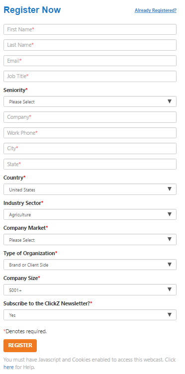
Wherever you can, cut out fields and be ruthless about it. You probably don’t need fifteen required fields on your form. And if you don’t want to cut out fields, at least make them optional. That’s all in your best interest since people are less likely to abandon your form if it’s easy to fill in.
Make sure labels are clear
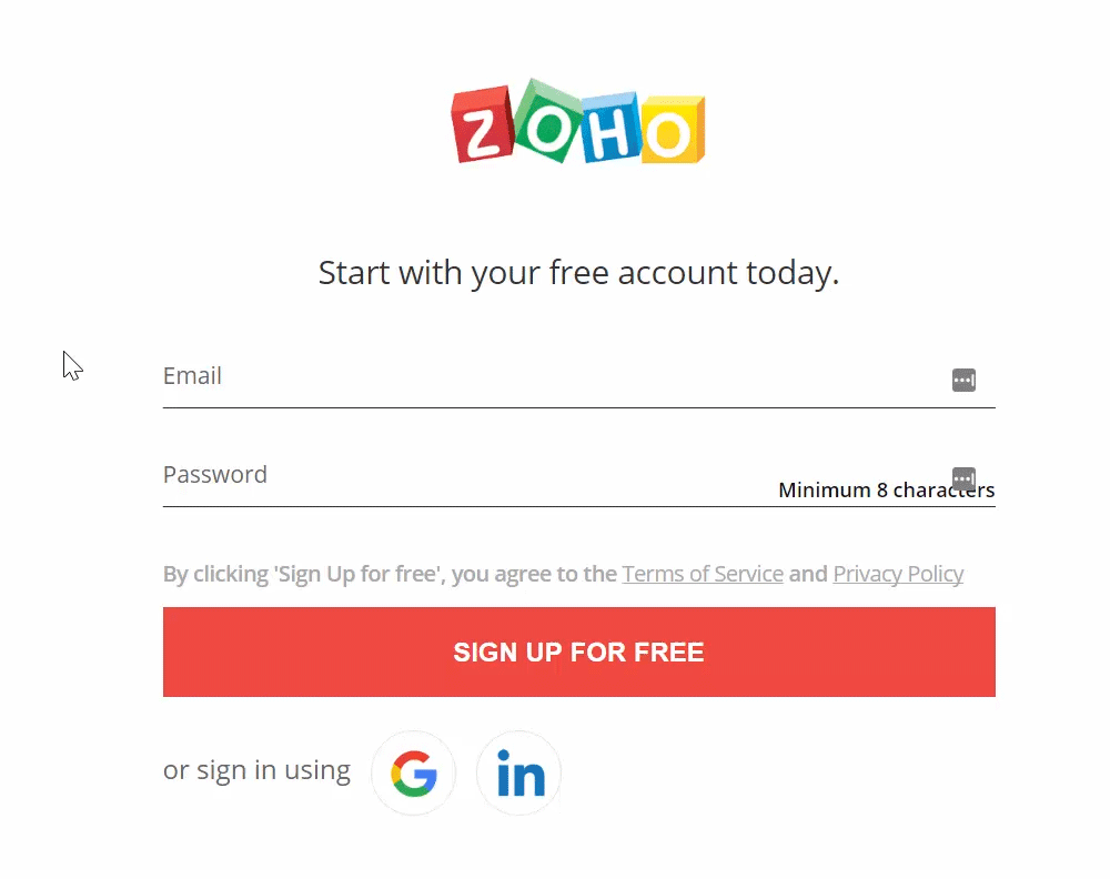
Labels are an important but tricky thing. I don’t like having them on top of a field because it can mess with the design. Placeholders (labels inside a field box) work better, but they’re not a good option either, for three reasons. First, screen readers don’t identify them as labels, alienating every person using that type of program. Second, styling options are limited. That may change with future updates to HTML/CSS. And third, when you start typing in a field, its placeholder disappears and you may forget what you wanted to type (name? email?)
So the solution is something like the below example where the placeholder shrinks but doesn’t disappear. We’re seeing this more and more around the web and for good reasons. At the time of this writing, this is the most elegant solution I’ve found to the label and placeholder issue on forms.
Use an external service
If for any reason you need a complex form, then try to use something like Typeform which makes the overall experience much smoother. They break down long forms in multiple steps, the design is easy on the eyes, and they let users know at what part of the process they are.
Calls to action
I find calls to action (or CTAs) are often overlooked and don’t receive the attention they deserve. When you invite your user to click on a button to buy your product, subscribe to your email list, or click to the next page, you need to make it as easy and obvious as possible.
Make them pop
One way to achieve this is by using colors. The color that will pop the most will also be the most noticeable one. And you do that by choosing a contrasting color to whatever else you’re using in your color scheme. A big red button will have much less impact if your base color is also red than say a green or blue button.

I would also advise using that one contrasting color for your CTAs and your CTAs only. Again, we’re going for impact here. Subconsciously, your user will register that one color as the color of action on your site.
Use one single CTA per page
You may have heard that one when talking about sales pages. But in fact, it’s true for all your pages. The least amount of distraction you give your user, the better chances of completion you’ll have. So sift your pages through a fine tooth comb and get rid of anything superfluous.
Speed
We’ve already talked about the importance of speed on mobile, but really, it’s an important factor overall. I have a full article dedicated to speeding up WordPress that you can use to improve your load times.
Conclusion
Optimizing your website won’t perform miracles if your product, service, copy or design sucks. But if all of this is good, these small changes can be the difference between low and high conversion rates.
 Sauvegarder un formulaire WordPress et ses réponses
 Formulaire de contact WordPress : le créer et l’optimiser
 Récupérer données formulaire WordPress